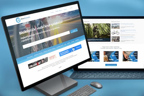
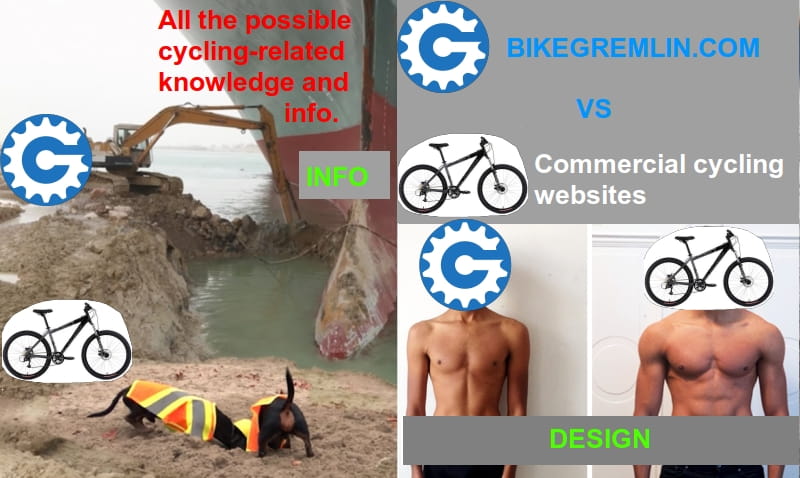
A story about BikeGremlin brand redesign, i.e. websites and YouTube channels redesign, including both visual, and user interface improvements. In a separate article I explained how the new design was technically implemented – i.e. how I built my WordPress website.
1. Introduction
I’ve been working with computers for decades (more about me). Related to websites, I can make anything technically (and secure the websites). However, when it comes to visuals… well… I’m the only person I know of who got less than a 3 (grades were from 1 to 5) in the art class of the Novi Sad Electrotechnical school, with the legendary professor Joe (Zoran Jovanović). He had crumpled my first assignment, throwing it in the trash and yelled at me, thinking that I was playing a practical joke on him… after a while, he had realised that I really am completely anti-talented for art and that I wasn’t intentionally playing dumb. 🙂
Yes, I’m that bad. 🙂
Hence, I knew that sooner or later, if I ever want my websites to look cool, I’d have to hire a good designer.
This year (2021), I started getting some collaboration and sponsorship offers from renowned companies. OK, I know my website content (articles) are top class, but if I’m going to do work with top brands, my websites have to look the part. How should I manage to do that? Then it struck me – my friend Masha is very good with those things. Also, she’s known my “brand” from the start, I don’t have to explain everything. So I called Masha. 🙂
Masha’s company website: 9design.co.rs, Masha’s Linkedin profile, and her latest project (work in progress) – banostorka.com tour guide. 🙂
2. BikeGremlin design evolution
Just for laughs, here are my design “jewels” from the past seven years: 🙂
Picture 1
Picture 2
Picture 3
Picture 4
Finally, after having read all about the complementary colours, white spaces etc, this is the best I could muster: 🙂
Picture 5
OK, I suppose it’s not too bad, but it’s not very good either.
But that’s not all! YouTube video thumbnail “artwork” could also be improved. Here’s their evolution:
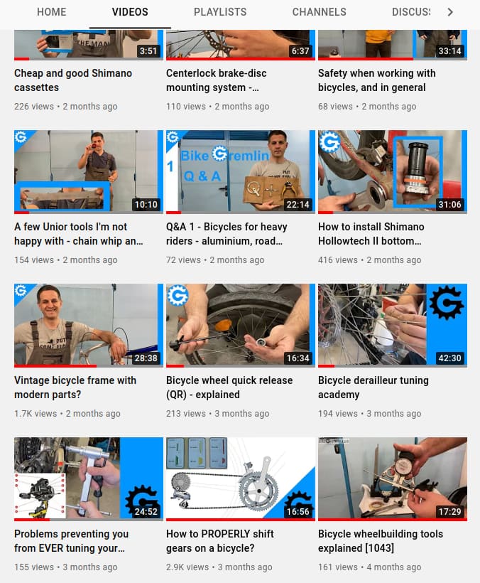
Picture 6
I almost forgot about the mascot. This is my line of thinking and the best I could do:
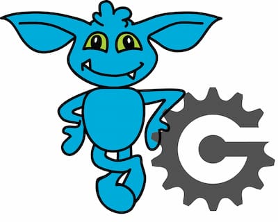
Picture 7
Finally, to joke a bit – what it looks like to me now: 🙂
Picture 8
3. Negotiations
The negotiations went very smoothly and simply. I showed Masha what I had managed so far (websites, YouTube cover art, and my other “artwork”) to see my line of thinking – and asked if she could make all that look nice, while still being easy to read and navigate.
Since we know I’m “vaccinated from aesthetics,” I said right from the start that whatever she thinks is good is OK – even if I don’t like it. I don’t take myself seriously when it comes to aesthetics. 🙂
Masha said she’ll make a working plan, with an estimated number of work-hours – and that was it.
4. Redesign plan
The first thing Masha did was making a redesign plan. Here’s what it looks like:
Phase 1: Branding
Designing the whole base visual identity. Logo, font (fonts), colours, visit cards, memo design etc.
Phase 2: Branding application
Applying the brand to all the segments used for presenting it. In this case, that’s the websites and the YouTube channels.
Phase 3: Wireframing and UX (User Experience)
After the visual identity design is approved, on to the wireframe and UX design. Website functionality and content will be shown using web-page drafts, with an emphasis on the following:
- Home page.
- Article category overview (list).
- One article (category post) definition, to be used with all the articles.
- About us page (in this case about the website author, i.e. me).
- Designing the main menu, submenus, footer and other segments that will direct website visitors towards the content that interests them.
Phase 4: Page graphic design and UI (User Interface)
After having defined the user experience and wireframes, we move on to the graphic design. That includes:
- Defining all the UI elements (colours, buttons, icons, fonts, input colours, paragraphs, headers, links…).
- Page design based on the drafts (home page, about the author, article overview, single article).
5. Website redesign
5.1. Branding
This phase went very quickly and smoothly (at least from my perspective).
Masha created everything related to my brand and asked me to approve it:
- Brand colours – main, secondary, and supplementary colours, for use with various kinds of backrounds and environments. The colours were defined using RGB, HEX, and CMYK – so any can be used, depending on the needs.
- Logo – with all the combinations: vertically placed (narrower), horizontally placed, logo sign, logo sign with text etc. With both the main, and complementary colours used (several versions).
- Fonts – for logo and headings, and for paragraph text.
- Icons for all the needed purposes – bicycles, computers, contact etc.
- Business card design. Using both main, and secondary colours (two versions).
- YouTube video thumbnail “masks.”
- Letter and memo heading and footer design.
- A T-shirt design. 🙂
I loved the look of the new design. Practically the same, but still different… better, more elegant.
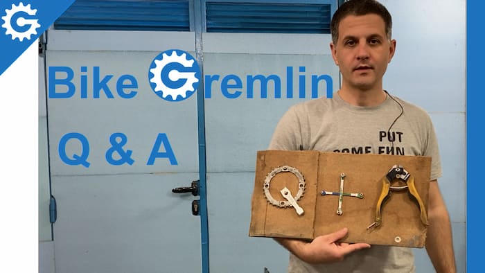
I suppose this was fast and easy for me because the designer is very good. 🙂 She did a great job, from the start. For one example – I asked if the base for my YouTube Q & A video thumbnail can be made to look nicer but using the same base picture (I thought that the apparatus I had made was a neat idea 🙂 ).
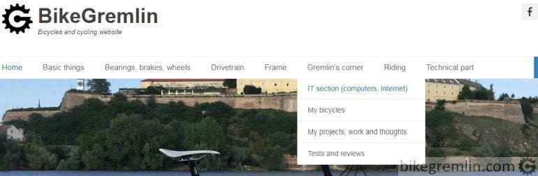
5.2. Branding application
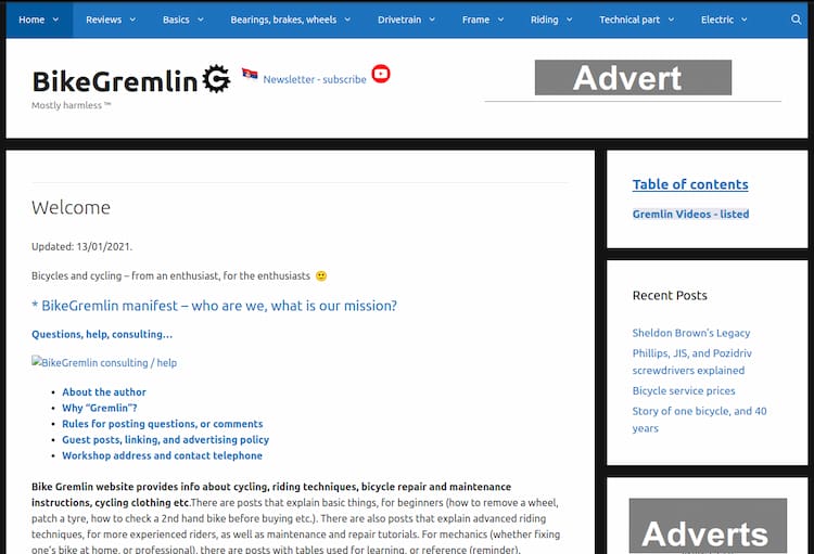
The quality is noticeable right after applying the new design. My design:
Picture 9
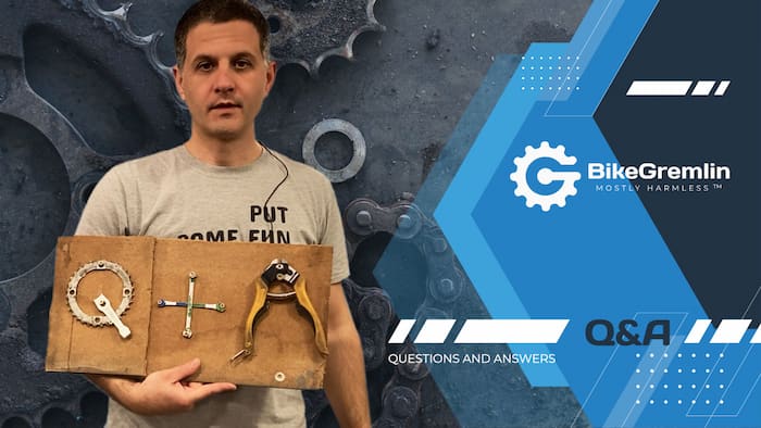
Picture 10
OK, my face still looks like a moron – but that’s not the designer’s fault. 🙂
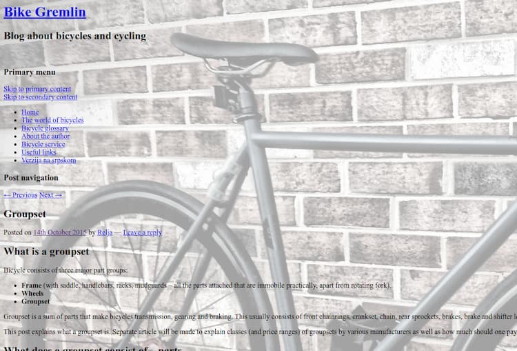
Old logo:

Picture 11
New logo – the primary, and the “backup” version:

Picture 12
5.3. Wireframing and UX
Wireframing and UX is basically the phase for making the website “skeleton” – defining the layout for various types of pages (home page, article list, single article etc.). Here’s what that looks like for the home page:
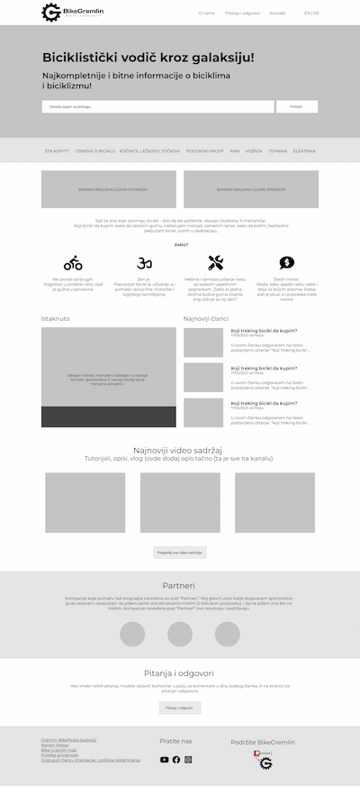
Picture 13
5.4. Page graphic design and UI
The part where it really looks good. 🙂 All the pieces are put together for the final website design look – with all the images, fonts, colours and the planned page-element layout. What that looks like for the home page:
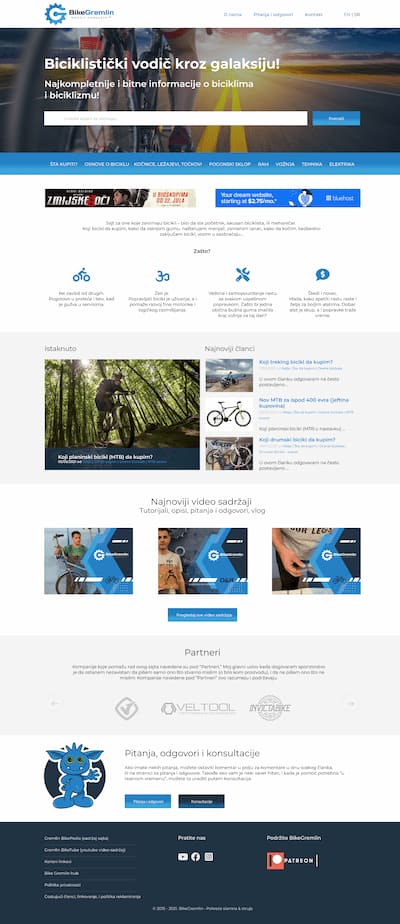
Picture 14
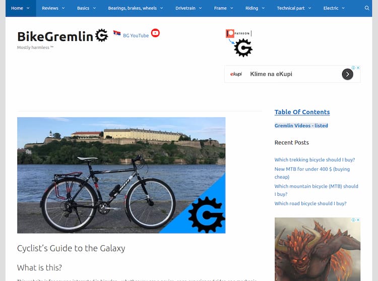
6. Final result and implementation
This is what Masha’s design looks like:
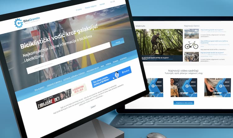
Picture 15
Looks great, but how do I turn this into a (WordPress) website?
Masha recommended I use the Kadence Virtue Premium theme for turning her design into a website.
I took a look at the Kadence Virtue premium theme and gave it a test. It looks well written and well optimized. There’s a built-in page builder – like Elementor (affiliate link), only better optimized, enabling a lot of options when configuring a website design – with no “manual” coding required (just click, drag & drop).
That’s all good, but here I came to my first dilemma:
Should I rely on a page builder, or use “an ordinary” WordPress theme, and add some coding (using a WordPress child theme for a start), asking a friend for help if I get stuck? My intuitive conclusion is that relying on relatively standard WordPress theme options and the current WordPress Gutenberg blocks structure would result in a more robust solution, in case of any future updates and changes. But it would require more coding or a compromise in terms of design.
I decided to give Blocksy theme a try (affiliate link). It is very easy to work with – all the options are nicely structured. A huge number of options is available even with the free version of the theme – more than I’ve seen with any other theme.
What I didn’t like was a lot of “!important” in the theme’s CSS output (for more details see the article “HTML and CSS explained“). Of course, documentation is not as good as for GeneratePress – but no theme comes near in those terms. Still, I managed to find a solution to the Blocksy child theme problem I faced at the start.
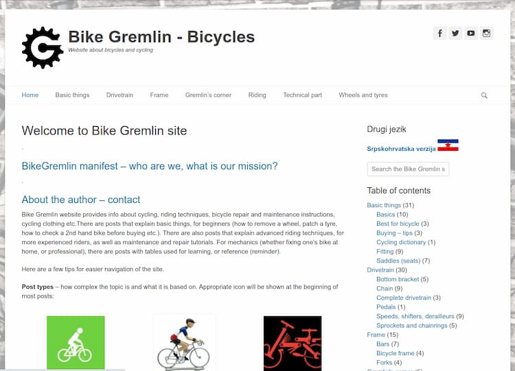
Here’s what my first attempt with the Blocksy theme looks like:
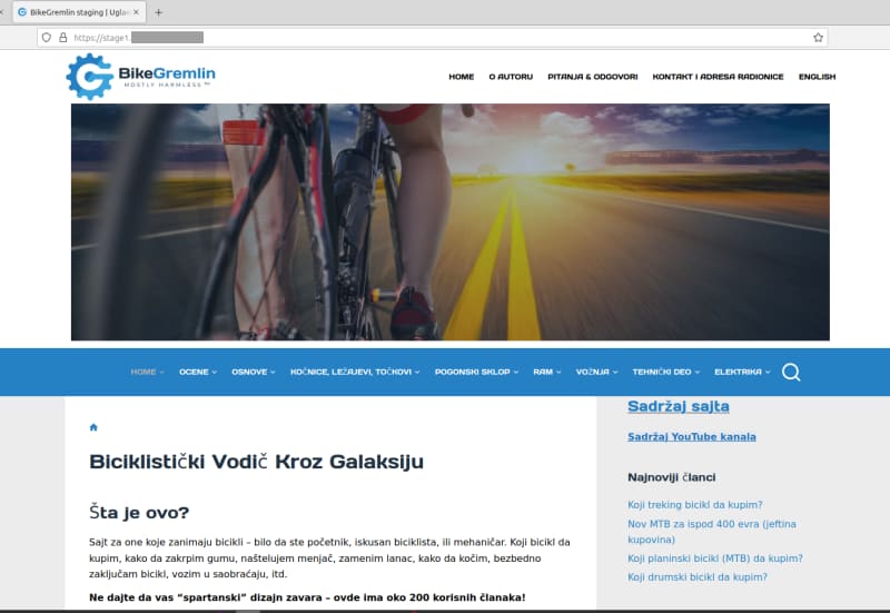
Picture 16
To me, this looks nicer than the original version, but it’s still not the same as Masha had designed. Though it is impressive how many changes of the design, article listings, category layout etc. I could do using a free WordPress theme. Blocksy lifetime subscription is currently on sale, but I have decided to wait. I’m a bit reserved because of the “strange CSS” and a few minor bugs I faced while configuring all the options. Though I doubt I’ll find a theme as polished and well documented as GeneratePress – its main downside being the more limited design at least with the free version – haven’t tested the Pro version yet.
It’s up to me to decide which tool to use for the implementation of the given design – all the three above-noted themes are still “in the game,” haven’t decided yet. So this story still lacks the last chapter. 🙂
6.1. Design implementation
I prefer to make something good – today,
BikeGremlin
than to make something perfect – in ten years.
To start by “humbly” quoting myself. 🙂
I played with several different themes in website staging environments. I was looking for a theme that works fastly, stably, and allows me to get the desired look and functionality with a minimum of “manual” coding. Yes, everything can be done by writing one’s own theme, but the available time is the limit, so you have to draw a line somewhere. I’m happy with Linux Mint and don’t intend to write (and maintain) my own operating system distribution. Likewise, I’m happy with using WordPress and a good pre-made theme.
I tried the Kadence Virtue Premium theme (affiliate link) and I couldn’t get what I need without a lot of coding and figuring out how that theme works. Then I tried a few other free themes. Blocksy (affiliate link) came close, but not quite, with a rather strange code generated.
OK, I’ll either do a lot of coding or pick a premium (paid) theme that does the job most easily. But which premium theme should I choose? The only premium theme that had good documentation, so I had a clear idea of how to get it all done before starting the job was GeneratePress Premium (affiliate link).
GeneratePress is my favourite theme and I had considered getting the premium version over the past two years. I saw that they are selling a lifetime package for $ 250, with a 500-website license limit. They also offer money-back in 30 days from the purchase, with no questions asked. Just in case, I asked their tech. support whether it’s OK if I buy, give it a test, then ask for the money back if I’m not happy – i.e. whether it would be more convenient for them to avoid the bank commissions and give me one website test license, so I can try, and then buy if I’m happy. They explained it is easier for them if I just ask for money back if I’m not happy, and that it’s perfectly fine. In addition to that – their support has been top-class for the free GeneratePress version, and they have by far the best technical documentation – just as I would write it. 🙂 You see where this is going?
I sold a few goats and started to work with the GeneratePress premium theme. 🙂

Picture 17
The biggest problem I had was making a big header image to be shown on the front page only, with the headline and a search box over the image (within the image).
GeneratePress hero page documentation helped with that – it’s quite nicely explained.
Since my websites are encyclopedia-like, having a high-quality search, with an interface that’s easy to see and use is important. Google programmable search was the answer. I configured it to search all of my websites and provide pages from any of my websites in the results. Why wouldn’t you be able to search how to replace a bike chain here? 🙂
For the Google search to work, I had to disable Cloudflare Rocket Loader, at least until I figure out what scripts exactly does the search use, to “bridge” only those – Cloudflare documentation on Rocket Loader specific JavaScript ignoring.
Those were the biggest challenges. The rest is just “touch-ups” using some custom CSS and PHP via a child theme.
OH, I almost forgot! The best caching plugin – LiteSpeed, has problems with widgets (solved, see below) in the latest WordPress version, 5.8. Note to self (as if I hadn’t known that already): never, never update to the “whole” versions, until they publish the first patch. I wrote about this attitude towards work (and software development) in the article: Zeitgeist: “Fake it ’till you make it!”
LiteSpeed hiccups solution: the plugin “AMP for GeneratePress” needed to be disabled, then re-activated. Without that, LiteSpeed option “DNS Prefetch Control,” when enabled, was causing problems when updating any widget changes.
I’m finishing the new design implementation using the GeneratePress premium theme. According to my website speed measuring results, GeneratePress works faster than any other theme I’ve used to implement the new design. I must add this – GeneratePress cheat sheet. Very good documentation. 🙂
For anyone interested, I wrote an article explaining the new website design implementation in details (theme, plugins, custom code, configuration etc.).
6.2. Site redesign video story
Last updated:
Originally published: